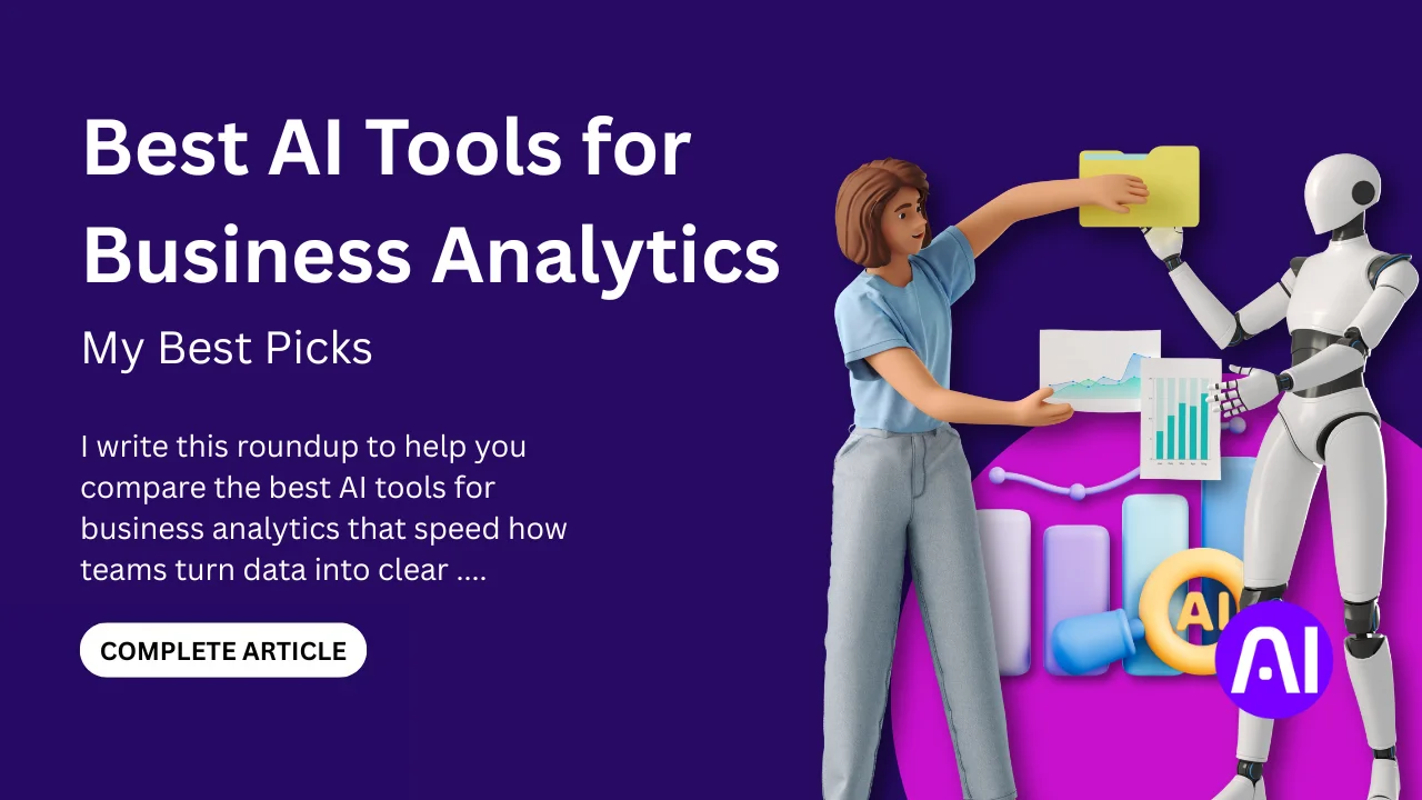
I write this roundup to help you compare the best AI tools for business analytics that speed how teams turn data into clear insights. By evaluating tools that eliminate manual tasks and surface hidden trends, this guide identifies solutions that empower users to act on information with greater speed and precision.
I will review at least seven options, each with a short overview, core features, pros and cons, and who should use it. I base selections on common capabilities like natural language search, predictive modeling, embedded dashboards, and automation of repetitive workflows.
The average company pulls from hundreds of data sources to feed analytics systems. These platforms help spot inconsistencies, predict trends, and deliver trustworthy intelligence so you can make faster decisions with less time spent wrangling processes.
Key Takeaways
- I will compare best AI tools for business analytics and dedicated solutions to help you choose the right product quickly.
- Expect consistent sections: overview, core features, pros and cons, and best for.
- Look for natural language search, predictive features, and strong data connectivity.
- These platforms reduce time on manual tasks and improve collaboration across teams.
- I include popular options like ThoughtSpot, Power BI, Tableau, Qlik Sense, and Looker so you can see tools like these side by side.
How I evaluate the Best AI Tools for Business Analytics in the United States
I test platforms against real business goals to see which ones speed up insight delivery and reduce manual work. My aim is to judge each product by practical outcomes: faster analysis, clearer insights, and measurable impact on teams.

Selection criteria aligned to business outcomes
I focus on features that drive day-to-day value: natural language search, predictive modeling, automated reports, and scheduling that cut repetitive tasks. I also rate usability for different users analysts, managers, and casual viewers so adoption is realistic.
- Business outcomes: time saved, clarity of insights, and workflow automation.
- Governance: semantic layers, modeling support, and trustworthy processes.
- Usability: onboarding, collaboration, comments, and alerts.
Data sources, integrations, and security considerations
I check how well platforms connect to Snowflake, BigQuery, Redshift, SQL Server, spreadsheets, and common line-of-business applications. Strong connectors let teams work from central data sources without heavy prep.
Security and governance are vital in the United States. I review access controls, encryption, and residency options. I also weigh pricing transparency and signals of real-world adoption like docs, community support, and release cadence.
1. ThoughtSpot for natural language insights and AI-powered dashboards
ThoughtSpot turns natural language questions into instant charts and tables against live company data. I use it to track KPIs in dashboards that refresh in real time and to surface trends without heavy modeling.
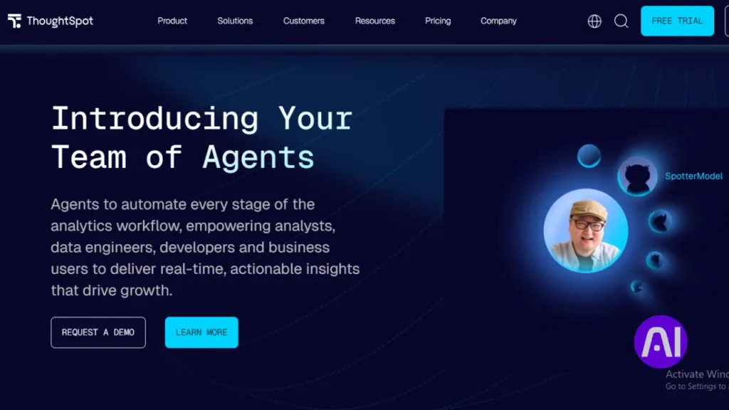
Overview
Spotter acts like an on-demand analyst. I type a question and Spotter answers with a visualization and follow-up prompts. Analyst Studio helps with data prep across SQL, Python, and R.
Core features
- Conversational search (Spotter) with follow-up questions.
- AI-powered dashboards that refresh live from cloud warehouses.
- AI-assisted data prep in Analyst Studio plus governed sharing for users and teams.
- Alerts for metric shifts and connectors to common business applications.
Pros and cons
Pros: rapid self-service insights, real-time connections, and easier access for nontechnical users.
Cons: a learning curve for advanced modeling and frequent feature updates that require adjustment.
Best for
I recommend ThoughtSpot to teams that want fast time to insight and natural language access across enterprise data. A 14-day trial and an Essentials plan at $1,250 per month for 20 users help size the initial commitment.
2. Microsoft Power BI for integrated analytics across the Microsoft ecosystem
If your data lives in Microsoft services, a native reporting option can cut integration time and simplify reporting. Power BI links Excel, Azure, and SQL Server so you can build interactive dashboards inside familiar apps. I use it when teams need quick access to reports without heavy data engineering.
Overview
Power BI provides a platform that connects spreadsheets and cloud sources. It helps users turn datasets into visual reports. Q&A and prompt-driven features let nontechnical users explore data without writing queries.
Core features
- Interactive dashboards and rich visualizations for reporting and decision making.
- Power Query for data preparation and modeling to reduce manual tasks and speed time to insight.
- Collaboration, role-based management, and workspace deployment for secure reporting.
Pros and cons
Pros include native integration with Microsoft identity and content management, an accessible interface, and flexible pricing tiers. I also like the natural language Q&A that lowers the bar for exploration.
Cons include performance tuning needed for very large datasets and limits when you require highly customized visuals. Careful modeling is essential to keep interactive reports responsive.
Best for
I recommend Power BI for organizations standardizing on Microsoft products that want dashboards and reporting close to Excel and Azure. Pricing ranges from a free account to Power BI Pro at $10 per user per month and Power BI Premium at $20 per user per month, so you can scale cost with use.
| Area | Strength | Consideration |
|---|---|---|
| Integration | Excel, Azure, SQL Server | Seamless for Microsoft stacks |
| Data prep | Power Query | Requires modeling for large datasets |
| Usability | Familiar interface, Q&A | Customization limits for complex visuals |
| Pricing | Free / $10 Pro / $20 Premium | Choose based on users and scale |
3. Tableau for advanced visualization and interactive analysis
I rely on visual storytelling to turn messy datasets into clear, decision-ready dashboards. Tableau helps me shape complex data into visual narratives that support analysis and stakeholder conversations.

Overview
Tableau offers a drag-and-drop interface that converts raw data into interactive views. It links to databases, spreadsheets, and cloud applications so I can combine many sources in one workbook.
Core features
- Deep visualization options and interactive dashboards for trend analysis and presentation.
- Built-in forecasting, trend lines, and connectors that unify datasets from multiple apps.
- Prebuilt accelerators and templates to cut time to value for teams and users.
Pros and cons
Pros: strong community, scalable handling of large datasets, and high-quality visuals for executive reports.
Cons: some parameter updates require manual work and complex cases need SQL or extra learning.
Best for
I recommend Tableau to teams that need rich visualization and flexible analysis to drive faster decisions. Creator starts at $75/month, Explorer $42, and Viewer $15, with a 14-day free trial.
| Area | Strength | Consideration |
|---|---|---|
| Integration | Databases, spreadsheets, cloud apps | Connectors cover common enterprise systems |
| Visualization | Advanced, presentation-ready charts | Requires design care for consistent reports |
| Performance | Handles large datasets with extracts | Optimize extracts and live connections for speed |
4. Qlik Sense for associative exploration and predictive analytics
Qlik Sense’s associative engine helps me follow data threads in any direction and uncover fresh insights. The platform blends visual discovery with forecasting so I can test what-if models without heavy scripting.
Overview
I use Qlik to explore linked datasets and reveal relationships that traditional queries miss. Its associative model lets me click through records and see related values instantly.
Core features
- Interactive dashboards and visual discovery that speed decisions.
- An associative data model that connects many sources without rigid joins.
- Machine learning integrations in Qlik Cloud for forecasting and models.
- Low-code app creation, storytelling, and multi-device viewing.
Pros and cons
Strengths include flexible exploration, strong visualization, and quick app builds without deep coding. Analysts can craft narratives that guide users through findings.
Tradeoffs are performance slowdowns on very large machine-sized workloads and rising per-user costs as adoption grows.
Best for
I recommend Qlik Sense to teams that need freeform exploration, predictive analytics, and governed deployment options across cloud or on-prem. A 30-day trial and Qlik Sense Business at $30/user/month make it easy to evaluate before scaling.
5. Google Looker for governed data modeling and embedded analytics
I often centralize definitions so analysts and app developers share a single source of truth. Looker lives in the browser and focuses on governed modeling that keeps metric logic consistent across dashboards and embedded experiences.
Overview
Looker uses a semantic layer to define fields and measures once. That model drives queries to cloud warehouses and returns fast, consistent results to users and applications.
Core features
- Governed data modeling and role-based management for secure sharing.
- Browser-based exploration and visualization that suit analysts and nontechnical users.
- Embedded analytics and APIs to surface insights inside customer applications.
Pros and cons
Pros include strong governance, fast queries on large sources, and consistent metrics across teams.
Considerations: modeling needs upfront work and Looker does not push many auto-generated reports.
Best for
I recommend Looker to companies that need a single, governed view of data and want to embed dashboards into operational apps.
| Area | Strength | Consideration |
|---|---|---|
| Governance | Central model | Modeling effort |
| Performance | Scales on warehouses | Depends on query design |
| Extensibility | APIs & embedding | Developer work needed |
6. Sisense for embedded analytics and developer-friendly workflows
When analytics must live inside customer-facing apps, I look for a platform that supports both developers and nontechnical users. Sisense blends a developer-first stack with low-code and no-code experiences so I can embed interactive visualizations where people work.
Overview
Sisense helps me bring data into applications with SDKs, APIs, and prebuilt components. Developers get the extensibility they need and business users get simple dashboards to explore information without code.
Core features
- SDKs and APIs for embedded analytics and custom visualization components.
- No-code dashboards, natural language queries, and generative features to speed insights.
- Role-based management, automation for scheduled tasks, and alerting to save time.
- Integration with cloud warehouses and operational systems for real-time access.
Pros and cons
- Pros: flexible interface components, strong extensibility, and clear developer workflows.
- Cons: governance and performance planning are needed as usage scales.
Best for
I recommend Sisense when a product team needs to embed reporting into applications while keeping a path for nontechnical users to self-serve. Security features like row-level controls and tenant isolation make it a sound platform for multi-tenant deployments.
| Area | Strength | Consideration |
|---|---|---|
| Developer stack | SDKs & APIs | Requires dev resources |
| Governance | Role-based security | Planning for scale |
| Integration | Cloud warehouses | Tune for concurrent users |
7. TIBCO Spotfire for real-time analysis and no-code visualization
I pick solutions that blend streaming and historical data to reveal issues before they escalate. Spotfire centralizes structured and unstructured data and makes live exploration simple with point-and-click visual workflows.
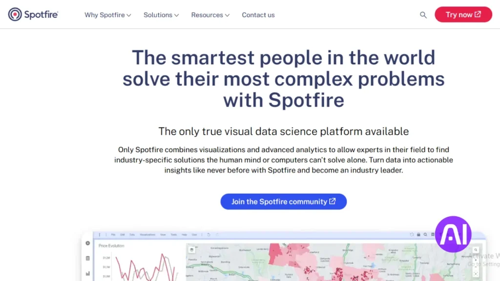
Overview
Spotfire lets nontechnical users explore live streams and stored sources without writing code. Its generative inputs help convert natural language prompts into charts and short narratives that explain patterns.
Core features
- No-code interface and guided visual exploration to refine questions quickly.
- Integration with cloud databases and IoT streams plus governance for secure sharing.
- Machine learning and predictive analytics that run on streaming and batch data.
- AI-powered recommendations and automatic generation of charts and report text.
Pros and cons
Pros: rapid visual exploration, demand forecasting, and live alerting that surface problems fast. Collaboration features let teams annotate dashboards and share annotated insights.
Considerations: pricing is custom and implementations need planning for very large streaming machine workloads and high concurrency.
Best for
I recommend Spotfire when operations monitoring, supply chain, or risk need immediate visibility. Start with a high-value use case and expand as adoption grows.
8. RapidMiner for machine learning, text mining, and automation
RapidMiner helps me move from raw datasets to production models with a visual canvas that also supports Python and R when needed.
Overview
I use RapidMiner to prepare data, mine text, and build predictive pipelines without constant coding. The guided interface onboards users while expert analysts can extend workflows with code. Teams document steps and share projects to keep work reproducible.
Core features
- Data preparation for complex datasets and visual profiling.
- Text mining and NLP components for unstructured content.
- Automated pipelines that schedule jobs and reduce repetitive tasks.
- Model building, validation, monitoring, and lifecycle management.
Pros and cons
Pros: strong automation, flexible modeling, and clear collaboration features that speed time to insight.
Considerations: advanced projects need training and planning for infrastructure and governance.
Best for
I recommend RapidMiner to teams that run machine learning projects across marketing, operations, and risk. It scales from pilots to enterprise deployment with version control and production scoring endpoints.
| Area | Strength | Consideration |
|---|---|---|
| Usability | Guided interface & code options | Training for power users |
| Deployment | Scoring endpoints & integration | Infrastructure planning |
| Governance | Version control & audit logs | Policy setup required |
9. KNIME for open-source workflows and team collaboration
I rely on open platforms when I need flexible workflows that teams can reuse and extend. KNIME gives me a visual canvas to build end-to-end data pipelines that blend many sources without locking work into code alone.
Overview
KNIME is an open-source data science platform that supports data prep, monitoring, and team collaboration. I can mix visual nodes with scripts so both non-coding users and coders contribute to the same workflow.
Core features
- Visual workflows and reusable components that speed onboarding and reuse.
- Data blending across databases, spreadsheets, and cloud sources.
- Extensions for machine learning, generative integrations, and custom nodes for coding users.
- Collaborative spaces, versioning, and templates to centralize learning and reviews.
Pros and cons
Strengths: open extensibility, a vibrant community, and strong reuse of workflows and models. Visualization options cover quick charts and connectors to BI applications.
Considerations: governance design and performance tuning matter as projects scale to large machine workloads. Enterprise needs may require extra planning and support.
Best for
I recommend KNIME when a team wants open-source extensibility, shared repositories, and repeatable applications of data and models. For hands-on evaluation, explore the KNIME platform, which offers a free personal plan, team plans from $99/month, and enterprise options.
| Area | Strength | Consideration |
|---|---|---|
| Collaboration | Shared workflows & versioning | Governance setup needed |
| Extensibility | Custom nodes & scripts | Requires advanced user contributions |
| Visualization | Built-in charts & BI connectors | Presentation often done in external apps |
| Growth | Community templates & learning | Scale needs performance tuning |
10. Akkio for fast predictive modeling and reports
Akkio speeds up predictive work so nontechnical users can build models and get reports in hours, not weeks.
I use Akkio to create simple predictive models from spreadsheets or databases. The interface is drag-and-drop, and chat-driven prep trims manual wrangling. Generated reports summarize outcomes so stakeholders understand trends and decisions quickly.
Overview
Akkio makes predictive analytics approachable. I connect sheets or databases, train a model with a few clicks, and review a draft report that explains what changed. That lowers barriers for teams that lack dedicated data scientists.
Core features
- Drag-and-drop model training and one-click deployment.
- Generative reports that highlight trends and suggested actions.
- Forecasting tools and chat-based exploration for natural language queries.
- Chat-driven data prep that speeds model-ready datasets.
Pros and cons
Pros: rapid time to predictive insights, beginner-friendly flows, and clear report generation that helps nontechnical users act.
Considerations: the tool can be limited for highly custom enterprise models and governance work may need extra controls.
Best for
I recommend Akkio to teams that want fast predictive analytics for marketing, sales, or customer operations without heavy staffing. Pricing starts with a free plan, User Basic at $49/user/month, User Pro at $99, and Build packages from $999/month, with enterprise options for larger rollout.
| Area | Strength | Consideration |
|---|---|---|
| Usability | Drag-and-drop + chat prep | Best for simple to mid-complex models |
| Reporting | Generative summaries & visuals | May need customization for exec decks |
| Pricing | Free to entry paid tiers | Build packages needed for scale |
Conclusion
To close, I’ll focus on practical steps to match your data needs with the right platform mix.
I summarize how each tool fits common scenarios: governed modeling, embedded applications, self-service exploration, and predictive work that speeds insights. Pick a platform based on your data landscape, governance needs, user skills, and how fast the organization must act.
Key features to weigh are natural language queries, interactive dashboards, visualization depth, and automated generation of reports. Align pricing and licensing to creators, viewers, and embedded audiences to keep cost and management clear.
Prioritize security, access controls, and auditability. Start with one or two high-impact pilots, set success metrics, and expand as teams adopt new workflows and automation.
I recommend piloting two or three finalists on your own sources, validate performance, and choose the tool that delivers the clearest insights for decisions.
FAQs
What criteria do I use to evaluate platforms like ThoughtSpot, Power BI, and Tableau?
I focus on outcome-driven measures: predictive accuracy, query speed, visualization clarity, ease of deployment, and how well each platform supports decision-making workflows. I also weigh integration with data sources, model monitoring, security, and cost-to-value for teams.
How important are integrations and data sources when choosing an analytics platform?
Very important. I look for native connectors to cloud warehouses (Snowflake, BigQuery, Azure Synapse), real-time ingestion, and support for common file formats. Good integration reduces ETL work and speeds up time to insight for analysts and product teams.
Can natural language queries really replace dashboards?
Not entirely. Natural language is great for quick exploration and getting answers fast, as seen in ThoughtSpot and Power BI Q&A. But I still rely on curated dashboards for recurring reporting, governance, and stakeholder presentations.
Which platforms are best for embedded analytics and developer workflows?
I recommend Sisense and Looker when you need embedded analytics and strong developer APIs. They provide SDKs, customization, and deployment options that suit product teams building analytics into applications.
What should I consider about security and governance?
I check role-based access control, row-level security, encryption at rest and in transit, audit logs, and compliance certifications like SOC 2 or ISO 27001. Platforms that offer centralized governance and data lineage help maintain trust across teams.
How do I choose between visual-first tools (Tableau) and model-first tools (RapidMiner, KNIME)?
Choose based on primary use case. I pick Tableau when storytelling and deep visual analysis matter. For data science workflows feature engineering, model training, and automation. I lean toward RapidMiner or KNIME, especially for teams that need reproducible pipelines.
Are low-code predictive platforms like Akkio useful for non-technical teams?
Yes. Platforms such as Akkio accelerate predictive modeling for business users by abstracting code and offering templates. I still advise validating models with data scientists and monitoring performance in production.
How do I assess total cost of ownership across these platforms?
I calculate license fees, implementation and training costs, required infrastructure, and ongoing maintenance. Evaluate time-to-insight improvements and automation benefits since they offset costs through faster decisions and reduced manual toil.
What role does visualization play in driving adoption?
Clear, interactive visuals increase adoption. I prioritize tools with customizable dashboards, accessible templates, and mobile support so stakeholders can explore data without heavy analyst help.
How do I evaluate performance for large datasets?
I test query latency, concurrency, and how a tool pushes computation to the data warehouse. Platforms that support in-database processing or columnar engines generally scale better for big datasets.
Which platforms are best suited for real-time analytics?
TIBCO Spotfire and some deployments of Power BI and Qlik Sense handle real-time streams well, especially when paired with streaming infrastructure like Kafka or Azure Event Hubs. I verify end-to-end latency and refresh strategies before deciding.
How should teams manage model governance and versioning?
I recommend using platforms with model registry features, audit trails, and CI/CD support. Integrating with Git, automated testing, and monitoring helps ensure models remain accurate and compliant over time.
What skills should my team have to get the most value from these platforms?
A mix of data engineering, analytics, and domain expertise works best. I value SQL proficiency, basic data modeling knowledge, visualization design sense, and at least one person familiar with machine learning concepts for predictive projects.
How do embedded analytics options affect product development timelines?
Embedding analytics can speed time-to-market if the platform offers robust APIs and SDKs. I plan for initial integration, auth flows, and UX work; with the right vendor this often reduces custom development compared to building from scratch.